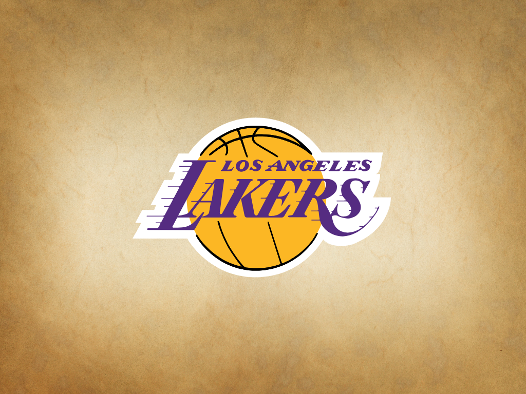
The Los Angeles Lakers are one of the most famous professional basketball teams in the world, with a long history since their founding in 1947. Besides their impressive achievements, the Lakers' logo has undergone several changes reflecting the team's evolving identity over time. Below is a summary of the history of the Los Angeles Lakers logo based on available data and general information about the team.
1. Early Years in Minneapolis (1947–1960)
The Los Angeles Lakers were originally known as the Minneapolis Lakers when established in 1947. During this period, the team’s logo was simple, mainly highlighting the name "Lakers" in a classic font, reflecting their roots as a team from Minneapolis, a region known for its many lakes.
The logo at this time typically featured the word “Lakers” in an easily recognizable style, often using purple and gold colors that would later become the team's signature.
2. Move to Los Angeles and the Classic Era (1960s to 1970s)
In 1960, the team relocated to Los Angeles and adopted the name Los Angeles Lakers. Their logo was updated to reflect their new city.
The classic Lakers logo introduced a basketball element colored orange with the words "Los Angeles Lakers" encircling the ball. The font became more modern with shadow effects to add a dynamic and energetic feel.
Purple and gold remained the main team colors, creating a strong and easily identifiable identity among fans.
3. The "Showtime" Era and Logo Modernization (1980s to 2000s)
During the 1980s, known as the "Showtime" era under Magic Johnson and Pat Riley, the Lakers’ logo saw minor updates but kept its key elements: an orange basketball with "Los Angeles Lakers" encircling it.
The logo was refined with sharper lines and brighter gold tones, highlighting the fast-paced and exciting style of play. This version of the logo continued with slight variations into the early 21st century.
4. Current Logo (2010s to Present)
The current Lakers logo still features an orange basketball with “Los Angeles Lakers” over it. The design continues to honor the legacy purple and gold colors.
This version is cleaner in detail and proportion, adapting to modern graphic design trends and global branding needs.
Color References of the Los Angeles Lakers Logo
The primary colors used in the Los Angeles Lakers logo are:

Purple and gold have been the core visual identity for decades, conveying a sense of prestige and energy. The orange basketball emphasizes their identity as a professional basketball team.
Conclusion
The Los Angeles Lakers logo is more than just a visual symbol; it represents the long journey from Minneapolis to becoming a global basketball icon in Los Angeles. The consistent use of purple and gold alongside the basketball element reflects the team’s strong identity and remarkable achievements over more than seven decades.
References
- History of Los Angeles Lakers (Indonesian Wikipedia)
- NBA Brand Guidelines
- Visual archives of various Lakers logos
- Official NBA sources and brand manuals


Comments (0)